Color Swatch Exploration
Before we could transition from our final wireframes to our final HTML prototype, we needed agree on an appropriate color pallette for our website. In order to brainstorm different color schemes, we came up with several swatch ideas for the website.
| Exploration palette |
Exploration palette |
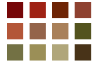
Palette #1 |
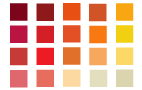
Palette #2 |
     |
Results
In order to reach our decision, we have to revisit the overall theme and mood behind our website. While our persona is motivated to attend wine tasting based her desire to further her knowledge, the social and fun atmosphere of the wine tastings themselves is what draws her into the community. Thus, we needed to pick colors that reflected this characteristic. Based on this, we choose Palette #2.
Palete #2 not only rings true with our initial mood board colors, but also matches the various colors of wine itself. By using predominantly warm colors (red & orange), we provided a sense of warmth and invitation. The beige and red colors are also wine colors, which speak directly to the content of our wine site.
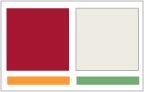
Having chosen a color pallette, we started using them to "color in" our wireframes to get a better feel how each of the colors would complement each other and how they would affect the informational content on the page (i.e. which areas of the website appeared to be salient than others).
|  IID.2006 - Project 3